When you come round to designing the website for your brand it can be fun to let those creative juices flow and have a little bit of fun with the layout and overall look of the website. This will be the main window to your business to people all over the world and it is important that it looks and feels exactly how you picture your brand to be. Saying this, colour is a large part of creating an atmosphere on your website, and today we are going to talk about picking a good website colour scheme.
Think simple
It is far too easy to look at the colours available to you and want to use every single one of them, but unless you want to really confuse colourblind people, you will want to keep things simple and stick to just a few colours. The best way to think about it is to choose two colours which are next to each other and go together, and then one colour which is opposite and that stands out. For example, a good choice could be blue and purple with a dash of orange to offset the cool tones.
Look for inspiration
It can be incredibly difficult for you to look at a colour spectrum and decide which colours you want to bring into your branding, and when it comes to going beyond primary and secondary colours for tones, it can make things even more difficult. The easiest way to come up with ideas is to get inspiration from other things. It could be looking at colour palettes on Pinterest, finding a piece of art and seeing what colours are there, or even looking at an interior design magazine and seeing what colours are put together.
Match your niche
It is important when you look at small business websites that you make sure your colours match the type of business you are. Colour can set the tone of a website and it can make a bigger impact than you think about what people see and how they feel on your website. If you are a wedding dress brand, for example, you don’t want to have colours like green and blue because these just don’t fit, instead you will want things like pink and pastel mint. Be sure to look at other similar companies and see the colours that they use.
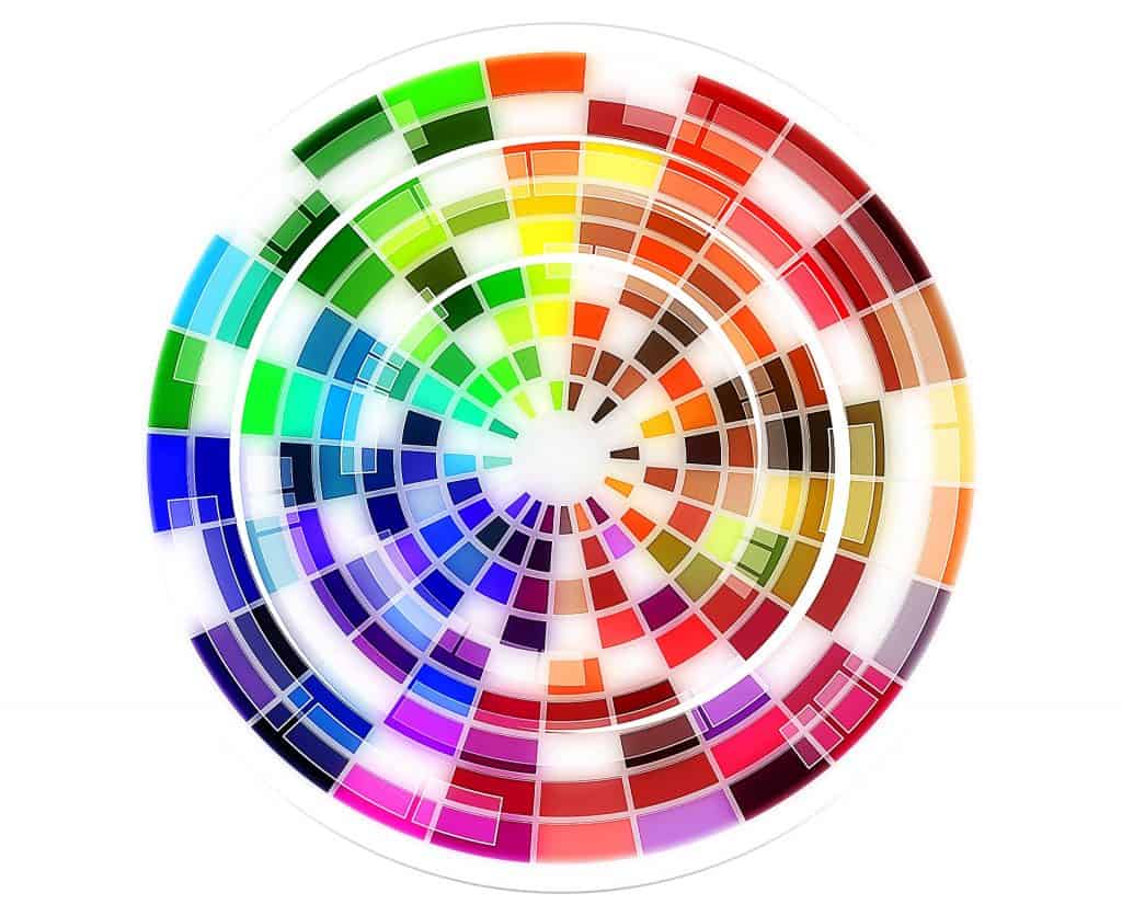
Use the colour wheel
The colour wheel is a fun little device and it is often used in art to mix paints and decide on colour schemes for pieces. You can also use this for your website colours this year. For example, if we go back to the idea of two colours next to each other and one opposite, we can see combinations like these:
- Red, orange and blue
- Green, yellow and pink
- Purple, pink and yellow
- Red, pink and yellow
- Blue, purple and yellow
You can see that you have a base of colours and then one which pops, and this can give you the help you need to design logos and things.
* This post has been written for Morning Business Chat by an outside source.